Adding a New Dashboard:
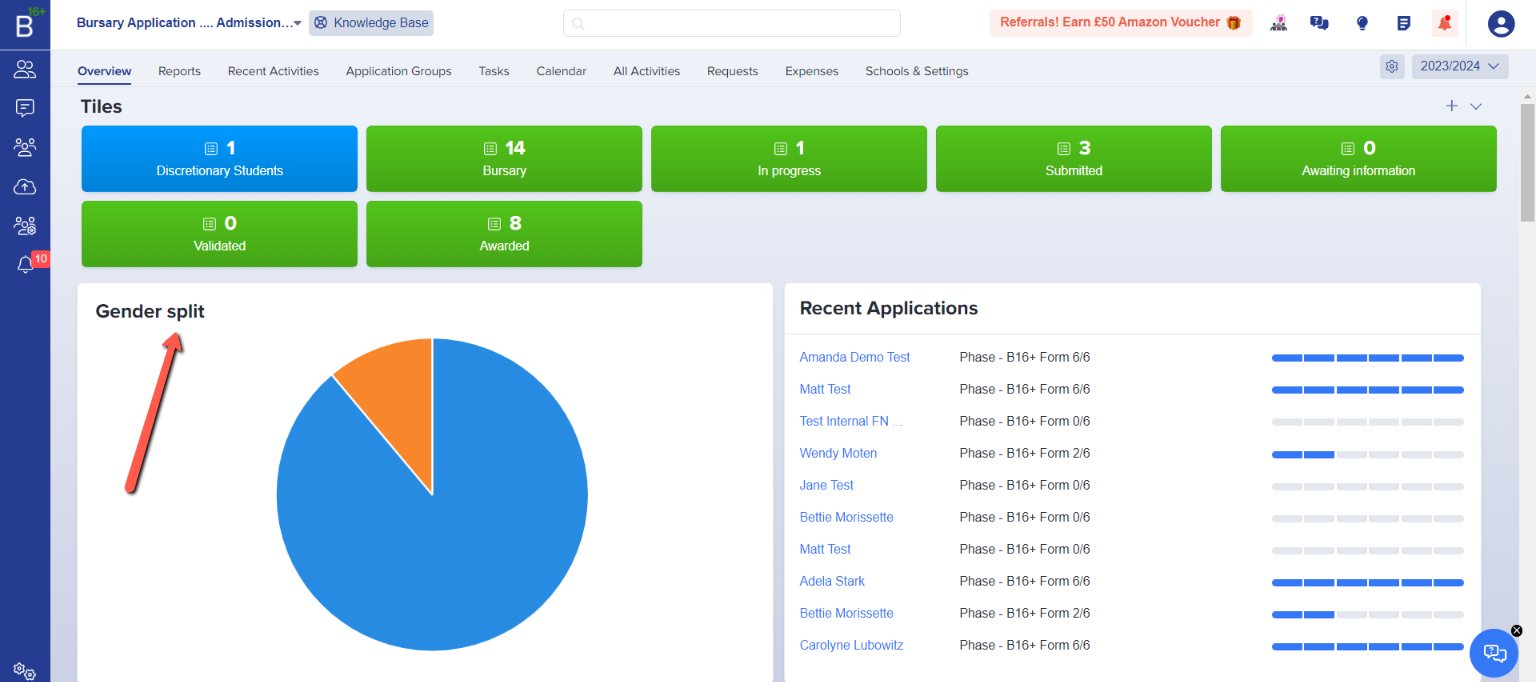
In the landing page you’ll see the reports Area
If no one from your school has yet created a reports dashboard, this is what it looks like: 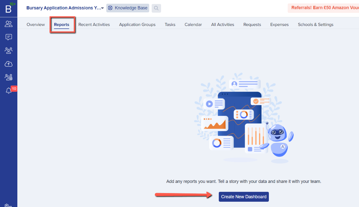
You can create a new dashboard in this page by simply clicking the “Create New Dashboard” tab at the bottom of the page.
Once you click that, a new window will pop-up. It will ask you to give your dashboard a name.

You can create more than one dashboard and you can either share it as Public where anyone on your platform can view and edit, or just make it private to your own view. You could name it "Bursary Applications" for example.
There is also an option to make it a default so when you log in the next time, that will be the reports dashboard that you will see. Don’t forget to click “Create Dashboard” to save it.
To view all the dashboards created in this form, you just have to click the arrow down right beside the name of the current dashboard you are viewing.

If you want to manage your dashboards, click the "Manage Dashboards" option in the menu.
 You can edit, view and delete the dashboard in this window. It will also tell you which dashboard is your default and whether it is shared (visible to other staff users).
Now you have created a dashboard, you may go on to create charts within that dashboard to show your data analysis.
Adding a Chart:
Once you’re done creating the dashboard, it will show in the left-hand corner of the page. Now, you will notice that tab at the bottom will say “Add a chart to this dashboard” you may click that to add a chart or by clicking the “+Add Chart” in the right-hand corner.

As with creating a dashboard, you may give your chart a name.
On the right of your screen you will see the options available for using data to create your chart. Currently we are only able to create charts based on student information; contact- based charts will be available in the future.
- Click “Student” to generate a chart for a student’s property
- Select the property to display > (the information you want to analyse eg gender split)
- Click Next


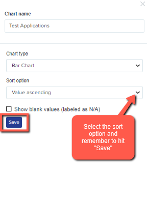
- Select the type of chart that you think best displays your data.

.
After choosing the type of chart, select the sort option and hit "Save".
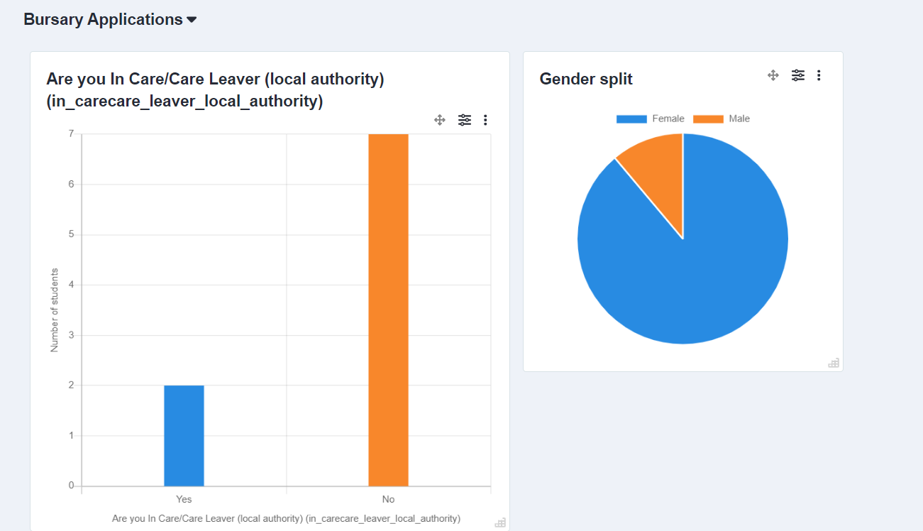
You will now see the chart(s) you created in the current dashboard you are using. In this page, you can also make some changes.
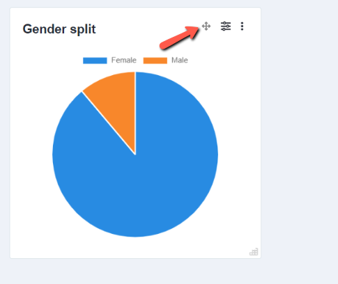
Click to move charts or switch their places:
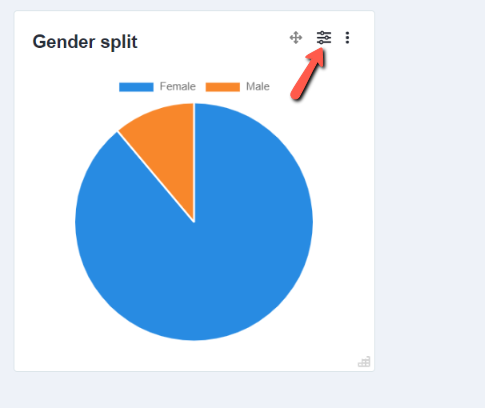
You can edit the filter details for the chart:
You can edit, duplicate, move a chart to a different dashboard, export CSV or delete:

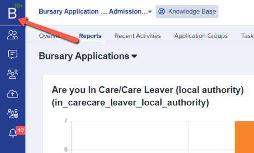
You can choose to display charts on your main dashboard. Click the B16+ icon to return to the main dashboard:
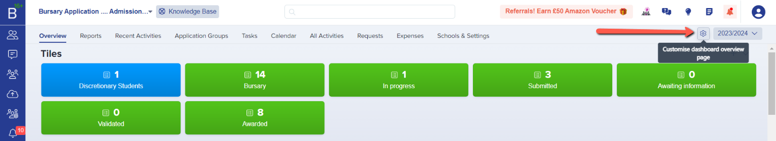
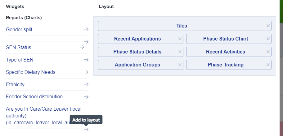
Click to customise the dashboard overview:
Click the arrow for the chart(s) you want to add to your dashboard:
Grab and drag the chart to the position you would like to display it in on your dashboard overview:
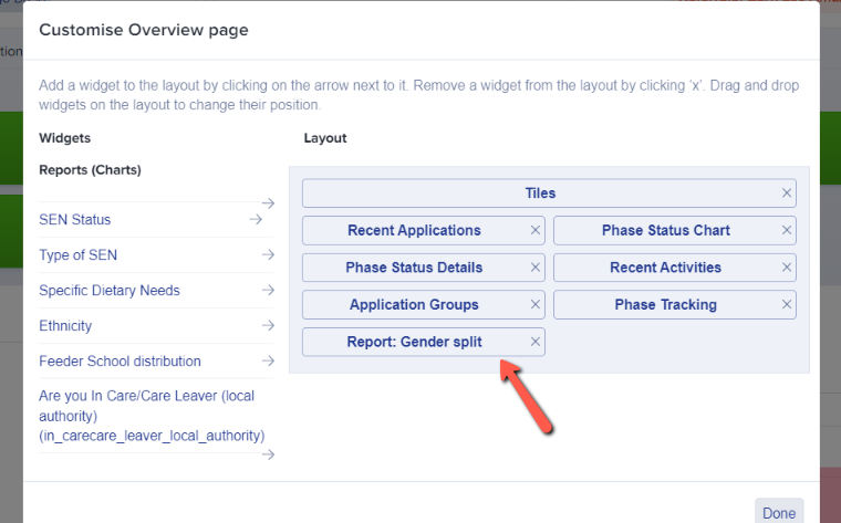

Click "done" and your settings will be applied: