Adding a Chart:
In the Reports tab on your system, once you’re done creating the dashboard, it will show in the left-hand corner of the page. Now, you will notice that tabs in the bottom centre of the page will say “Add a chart to this dashboard” and you may click that to add a chart, or click the “+Add Chart” in the right-hand corner.

- Click “Student” to generate a chart for a student’s property.
- Select the property to display > (the information you want to analyse eg SEN, medical, gender, current school).
- Click Next.


Select the type of chart that you think will best display your data. We currently have pie, bar, summary and row charts, as well as stacked bar and row charts, available in the reports area.

A new addition to our chart types are our Stacked Bar and Row Charts. This is useful for when you want to show comparisons over several categories.

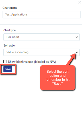
After choosing the type of chart, select the sort option and hit "Save".
You will now see the chart(s) you created in the current dashboard you are using. In this page, you can also make some changes.
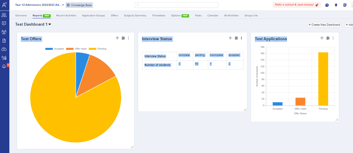
Click "Drag and Drop Cursor Icon" to move charts or switch their places. You can also edit the filter details to change the data being shown. You can edit, duplicate, and move a chart to a different dashboard, export as a CSV or delete it completely.

You can create as many charts as you need, for any data which is of value to you.